Fall 2024 & Spring 2025

Cobalt
Men's Luxury Skin Care

Design
Brief
"
Western cowboy meets downtown bachelor, a city boy with luxurious tastes. Masculinity is rediscovered in organic forms and materials. Built for a man with a routines, plans, and goals. Beginning with the care of self and nuturing of mind and body through ritual and application. This design encompasses the rugged masculinity found in cowboy lifestyle combined with simple, clean design that pays homage to prestine nature and its natural elegance. The twin horseshoe›s symbolize Cobalt & Co. and the western cowboy aesthetic the brand is rooted in.
"
01
Inspiration
Inspired by Western American cowboy ruggedness, with incorporated natural influences of leather, organic material, and raw metals. I conducted research online and in person as a way of getting inspired and understanding the men's skincare market. Here are some images from my interest board for this project.

02
Rationale and Research
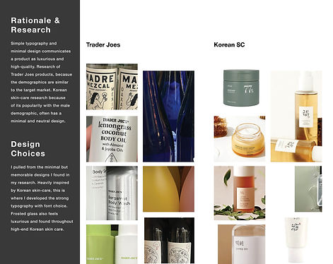
Simple typography and minimal design communicate a product as luxurious and high-quality. I did research on Trader Joe's products and Korean skin care because of their popularity with the male demographic. Both have minimal and androgynous designs. I pulled a color palette from my observations and began sketching.

Describe your image

Describe your image

Describe your image
03
Finding System
I constantly revised my design throughout the process of creating the brand packaging. I always pulled from the roots of my brand identity, constructing variation after variation.

04
Logo
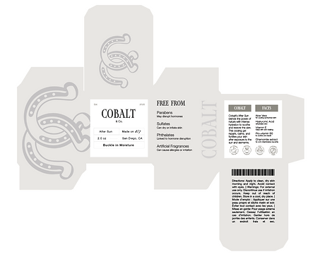
For my logo, I outlined a horseshoe to create a dynamic logo that encompasses the Cobalt & Co. name. The two Cs represent this and the human connection to nature through natural and high-end ingredients.

05
Label Exploration
Simultaneously, while I was still designing packaging, I was also exploring jar designs. Constructing the label made me consider merging legibility with elegant design while also abiding by my brand image. The belt represents the brand's "Buckle in moisture" tagline.

06
Final Packaging Design
After deciding on my final packaging design, I went ahead and made a system of other skin care products: sunscreen and after-sun, as well as a hyaluronic acid box.


07
Brand Proposal
At the start of a project, a design proposal is created to communicate
important aspects of the design process, objectives, scope, and expectations to all
relevant stakeholders. Here is my finalized proposal for the client.


08
Brand Stylescape
After altering my design, I went back and refined my initial style cape with more sophisticated research and market understanding. I knew my ideal market would be young, affluent, and ambitious young men in their twenties. These men are likely already invested in their image and ready to explore high-end skin care.


